


As a web developer, it's important to stay up-to-date with the latest technologies and trends in web design. One of the most popular and useful tools for creating responsive layouts is Flex Box. In this article, I'll introduce you to the basics of Flex Box and show you how to use it to create responsive layouts.
Introduction to Flex Box
Flex Box, also known as CSS Flexbox, is a layout module in CSS that allows you to create flexible and responsive layouts with ease. Flex Box was created to solve some common layout problems that web developers face, such as centering elements vertically and horizontally, creating equal-height columns, and creating responsive layouts.
Before Flex Box, developers had to use workarounds such as floats and positioning to achieve these layouts. These methods could be time-consuming and frustrating, especially when building complex layouts.

Flex Box simplifies the process of creating layouts and makes it more intuitive.
What is Flex Box?
Flex Box is a module in CSS that allows you to create flexible and responsive layouts. It does this by allowing you to control the alignment, direction, and size of elements in a container. Flex Box uses a set of properties that you can apply to the container and its child elements.
To use Flex Box, you need to first define a container element and set its display property to flex. This tells the browser to treat the container as a flex container and apply the Flex Box properties to its child elements.
Browser Support
The good news is that Flexbox support is pretty widespread. It's supported in all modern browsers, including Safari 8 and up, Firefox 28+ (including mobile), Chrome 35+ (including mobile), Opera 25+, Edge 16+, and IE 11+. However, if you need to support older versions of Internet Explorer then you'll need to use a polyfill library like Respond.js or Modernizr which will add support for CSS3 features like Flexbox. If you want to check whether or not your browser supports Flexbox before using it in your code then there are several ways to do this:
You can use the @supports rule at the top of your CSS file: @supports (display: flex) { /* Your code here */ }
Basic Concepts of Flex Box
There are a few basic concepts that you need to understand before you can start using Flex Box. These include the flex container, flex items, main axis, and cross axis.
The flex container is the parent element that contains the flex items. The display property of the flex container must be set to order to use Flex Box.
Flex items are the child elements of the flex container. The Flex Box properties are applied o these orders to control their alignment and sizing.
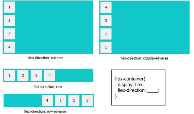
The main axis is the primary axis that runs through the center of the flex container. The value of the flex-direction property determines the direction of the main axis.
The cross axis is perpendicular to the main axis and runs through the center of the flex container. The value of the flex-direction property determines the direction of the cross-axis.
Properties of Flex Box
These properties include flex-direction, justify-content, align-items, align-self, and flex-wrap.
1) The flex-direction property determines the direction of the main axis. It can be set to
rowcolumnrow-reversecolumn-reverse
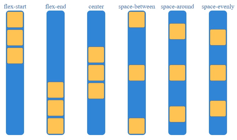
2) The justify-content property determines how the elements are aligned along the main axis. It can be set to
flex-startflex-endcenterspace-betweenspace-around
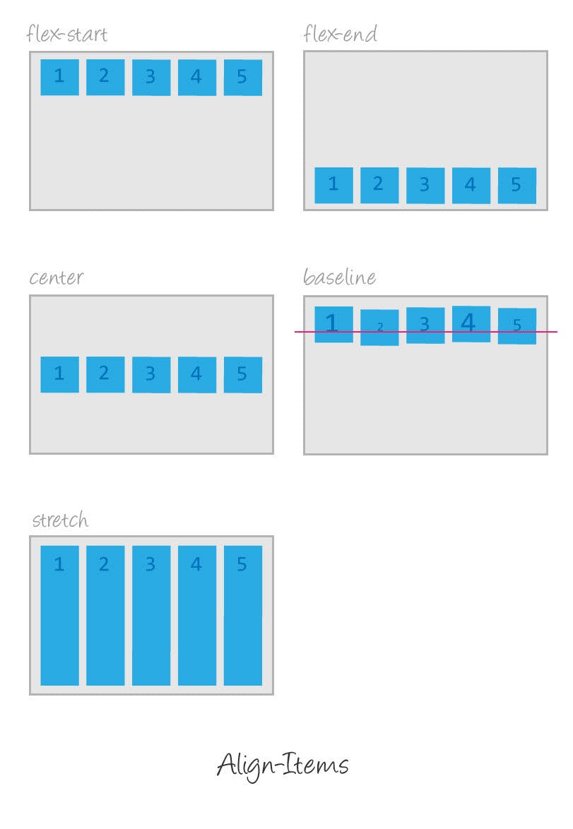
3) The align-items property determines how the elements are aligned along the cross-axis. It can be set to
flex-startflex-endcenterstretchbaseline
4) The align-self property allows you to override the align-items property for individual items.
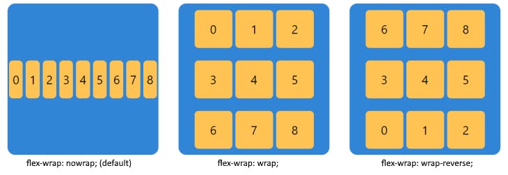
5) The flex-wrap property determines whether the elements should wrap to a new line when they exceed the width of the container. It can be set to
no-wrapwrapwrap-reverse
Tip: My favourite elements are space-between, space-around, and flex-wrap 😉. Make sure you use them in flex box designs. These properties will do wonders for you.
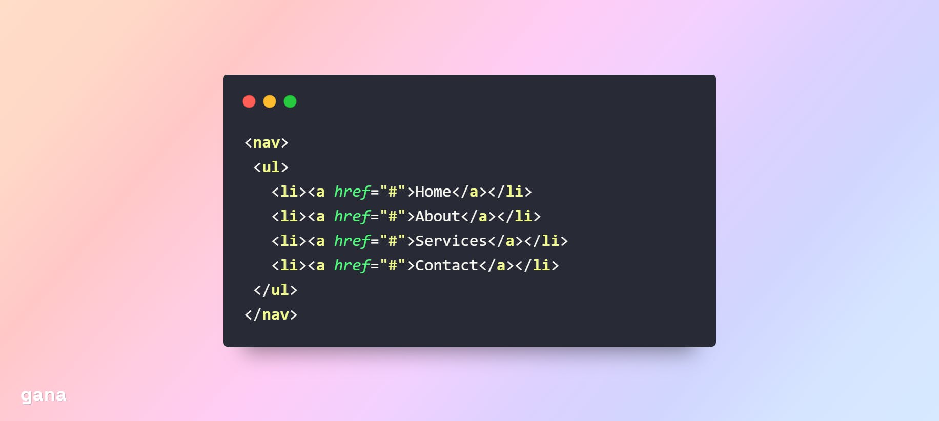
Flex Box Example - Creating a Responsive Navigation Menu
Let's take a look at how you can use Flex Box to create a responsive navigation menu. We'll start with a basic HTML structure for our navigation menu:
To create a Flex Box layout, we need to set the display property of the nav element to flex:
nav {
display: flex;
}
This tells the browser to treat the nav element as a Flex Box container. Now we can use the Flex Box properties to control the layout of our navigation menu.
To align the items along the central axis, we can use the justify-content property:
nav {
display: flex;
justify-content: space-between;
}
This will align the items along the main axis with equal space between them. To align the things along the cross-axis, we can use the align-items property:
nav {
display: flex;
justify-content: space-between;
align-items: center;
}
This will center the items along the cross-axis. To make the navigation menu responsive, we can use the flex-wrap property:
nav {
display: flex;
justify-content: space-between;
align-items: center; flex-wrap: wrap;
}
This will allow the items to wrap to a new line when they exceed the width of the container. With these Flex Box properties, we've created a responsive navigation menu that looks great on desktop and mobile devices.
Advanced Flex Box Concepts
Flex Box has many advanced concepts that you can use to create complex layouts. These include the flex-grow, flex-shrink, and flex-basis properties, as well as the order property and the flex shorthand.
The flex-grow property determines how much space an item should take up along the main axis. It can be set to a number to indicate the proportion of available space that the item should take up.
The flex-shrink property determines how much an item should shrink if there isn't enough space along the main axis. It can be set to a number to indicate the proportion of available space that the item should give up.
The flex-basis property sets the initial size of an item before any available space is distributed. It can be set to a fixed size, a percentage, or the keyword auto.
The order property allows you to control the order in which the items are displayed. It can be set to a number to indicate the order in which the item should appear.
The flex shorthand property allows you to set the flex-grow, flex-shrink, and flex-basis properties in one declaration. It can be used to simplify your code and make it more readable.
Flex Box Resources and Tools
There are many resources and tools available to help you learn and use Flex Box. Some of the best resources include CSS-Tricks, W3Schools, and the Mozilla Developer Network.
In addition, there are many tools available that can help you create and test your Flex Box layouts. Some of the best tools include Flexbox Froggy, Flexbox Defense, and Flexbox Playground.
Conclusion
Flex Box is a powerful tool for creating flexible and responsive layouts in CSS. By understanding the basic concepts and properties of Flex Box, you can create complex layouts with ease. With its intuitive syntax and powerful capabilities, Flex Box is quickly becoming the go-to layout module for web developers. So why not give it a try and see how it can simplify your CSS code and improve your layouts?